时间序列分析的提示工程掌握
为分析时间序列数据设计可靠的提示
时间序列分析是分析按时间戳或日期排序的数据的任务。它可以包括生成可视化图表、执行季节分解、构建时间序列预测模型等。时间序列分析在零散的行业中都有广泛的应用,包括零售、金融和医疗保健。例如,在零售业中,时间序列分析用于消费产品需求预测、促销计划、价格优化等。
时间序列分析很有用,因为它可以帮助公司识别数据中的基本趋势和模式。这可以帮助公司获得对推动需求和收入的因素有所了解的行动洞察。例如,知道哪些地区对特定产品集有较高需求可以帮助公司管理这些地区的库存。此外,某些产品具有季节性需求,了解这些季节性模式可以帮助公司决定何时促销、打折和管理库存。所有这些应用可以帮助公司优化收入、保留客户并推动增长。
生成式人工智能的兴起导致了在技术任务(如时间序列分析)方面的广泛应用。借助生成式人工智能工具,如ChatGPT,企业可以利用时间序列分析来推动其解决业务问题的技术方法。这包括理解和探索可视化时间序列数据的选项,执行季节性和趋势分析以及时间序列预测。
在本文中,我们将开发一系列精心设计的提示,以帮助启动我们的时间序列分析方法。为了我们的目的,我们将使用DataFabrica上提供的合成信用卡交易数据。该数据包含了合成信用卡交易金额、信用卡信息、交易ID等内容。免费版可以免费下载、修改和共享,遵循Apache 2.0许可证。
可以在这里找到一个包含大量示例的完整的引擎提示、输出及其附带的Jupyter笔记本,比本文讨论的内容更全面。
入门指南
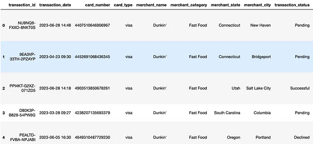
开始之前,让我们导航到您选择的集成开发环境(IDE)。我个人使用Jupyter Notebooks,但请随意选择您熟悉的任何IDE。我们将通过将我们的信用卡交易数据读入Pandas数据帧并显示前五行数据来继续进行:
df = pd.read_csv("synthetic_transaction_data_Dining_SMALL_w_items.csv")
print(df.head())
我们在数据中看到有transaction_date,merchant_name和transaction_amount。我们将使用这三列生成时间序列数据。让我们过滤数据框,将这三列包括在内,并将结果存储在一个新的变量ts_df中:
ts_df = df[['transaction_date', 'transaction_amount', 'merchant_name']]
接下来,我们将把transaction_date转换为Pandas的日期时间格式:
ts_df['transaction_date'] = pd.to_datetime(ts_df['transaction_date'])
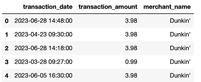
接下来让我们显示 ts_df 数据帧的前五行:
ts_df.head()
接下来,为了简单起见,让我们考虑一个单独的商家。让我们将数据筛选为仅包括“Dunkin”的销售,并对月份进行分组,我们将使用交易日期进行处理:
ts_df = ts_df[ts_df['merchant_name'] == "Dunkin'"]
ts_df['month'] = ts_df['transaction_date'].dt.month
ts_df = ts_df[ts_df['month'] <= 12]
ts_df = ts_df[ts_df['month'] >= 1]
ts_df['month'] = ts_df['month'].astype(str)

ts_df['year'] = ts_df['transaction_date'].dt.year
ts_df['year'] = ts_df['year'].astype(str)

ts_df['month_year'] =  ts_df['year'] + "-"+  ts_df['month']
ts_df['month_year'] = pd.to_datetime(ts_df['month_year'])

ts_df = ts_df.groupby('month_year')['transaction_amount'].sum().reset_index()
现在我们已经准备好进行时间序列数据的分析了。接下来我们将导航至chatgpt.openai.com并登录。如果您还没有账户,您可以使用Gmail账户轻松注册。

登录后,您应该能看到如下的聊天窗口:

接下来,我们将通过使用ChatGPT提示工程来演示如何提高带时间序列数据可视化的效果。
时间序列可视化
根据您对数据科学和Python的熟悉程度,任务类型以及随之而来的任务复杂度可能会有很大差异。对于每个时间序列分析任务,我会逐步增加提示和任务的复杂性,以展示有效的提示工程。
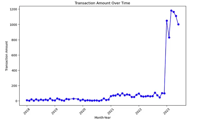
让我们首先请求ChatGPT生成一个时间序列线图:
可视化提示1:
Write python code that generates a line plot given a dataframe with
month_year and transaction_amount.
输出:
import pandas as pd
import matplotlib.pyplot as plt

# Sample DataFrame
data = {'month_year': ['2023-01', '2023-02', '2023-03', '2023-04'],
        'transaction_amount': [100, 150, 120, 200]}

df = pd.DataFrame(data)

# Assuming 'month_year' is in datetime format
# If not, you can convert it using df['month_year'] = pd.to_datetime(df['month_year'])

# Sorting the DataFrame by month_year
df['month_year'] = pd.to_datetime(df['month_year'])
df = df.sort_values(by='month_year')

# Plotting
plt.figure(figsize=(10, 6))
plt.plot(df['month_year'], df['transaction_amount'], marker='o', linestyle='-', color='b')

# Adding labels and title
plt.xlabel('Month-Year')
plt.ylabel('Transaction Amount')
plt.title('Transaction Amount Over Time')

# Rotating x-axis labels for better readability
plt.xticks(rotation=45)

# Display the plot
plt.show()
我们会注意到代码正在使用变量df,这是ChatGPT合成出来的。我们希望这段代码引用我们的数据框ts_df。我们可以按照以下方式更新我们的提示:
可视化提示 2:
Write python code that generates a line plot given a previously
dataframe called ts_df with month_year and transaction_amount.
输出:
'''
Prompt:

Write python code that generates a line plot given a previously
dataframe called ts_df with transaction_date and transaction_amount.

'''

import matplotlib.pyplot as plt

# Assuming 'month_year' is in datetime format
# If not, you can convert it using ts_df['month_year'] = pd.to_datetime(ts_df['month_year'])

# Sorting the DataFrame by month_year
ts_df = ts_df.sort_values(by='month_year')

# Plotting
plt.figure(figsize=(10, 6))
plt.plot(ts_df['month_year'], ts_df['transaction_amount'], marker='o', linestyle='-', color='b')

# Adding labels and title
plt.xlabel('Month-Year')
plt.ylabel('Transaction Amount')
plt.title('Transaction Amount Over Time')

# Rotating x-axis labels for better readability
plt.xticks(rotation=45)

# Display the plot
plt.show()
运行时,结果如下图所示:
根据我的经验,ChatGPT通常默认使用Matplotlib创建图表,除非您明确指定了只能通过特定库完成的特定类型可视化,或者直接指定您希望使用的库。例如,我们可以指定使用Plotly库生成线形图。
可视化提示3:
Write python code that generates a line plot, using Plotly, given a previously
dataframe called ts_df with month_year and transaction_amount.
输出:
import plotly.express as px
import pandas as pd

# Assuming 'month_year' is in datetime format
# If not, you can convert it using ts_df['month_year'] = pd.to_datetime(ts_df['month_year'])

# Sorting the DataFrame by month_year
ts_df = ts_df.sort_values(by='month_year')

# Plotting with Plotly Express
fig = px.line(ts_df, x='month_year', y='transaction_amount', markers=True, line_shape='linear', title='Transaction Amount Over Time')
fig.update_layout(xaxis_title='Month-Year', yaxis_title='Transaction Amount')

# Show the plot
fig.show()
个人而言,我是 Plotly 的粉丝,因为它允许你在图表上悬停在数据点上并查看具体数值。
主要要点:
- 指定变量:如果未指定,ChatGPT将自行定义变量和/或使用未定义的变量名。
- 指定列:与变量类似,如果要对其执行某些逻辑的列未指定,则ChatGPT通常会引用一个通用的列名,该列名可能不存在于您的数据中。
- 指定库: 在我们的最终提示示例中,我们指定了 Plotly 库,但如果你更喜欢 Seaborn 或任何其他库,你应该在提示中明确指出。否则,ChatGPt 可能会使用库的默认选项。
时间序列预测
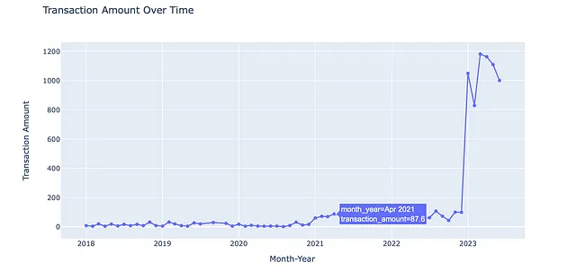
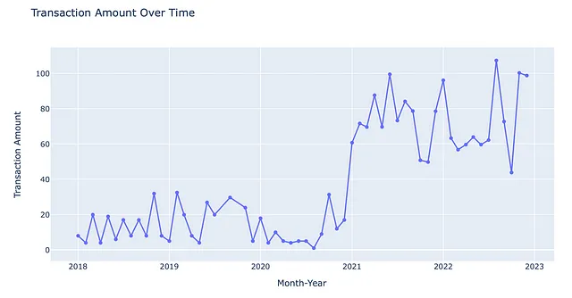
ChatGPT提示工程在构建时间序列预测模型方面也非常有帮助。在生成提示之前,让我们过滤掉2023年1月1日之后的数据点:
ts_df = ts_df[ts_df['month_year'] < '01-01-2023']
现在我们的情节如下:
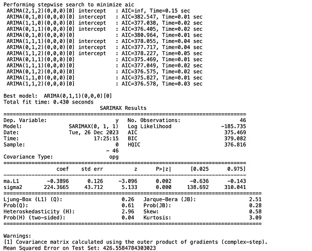
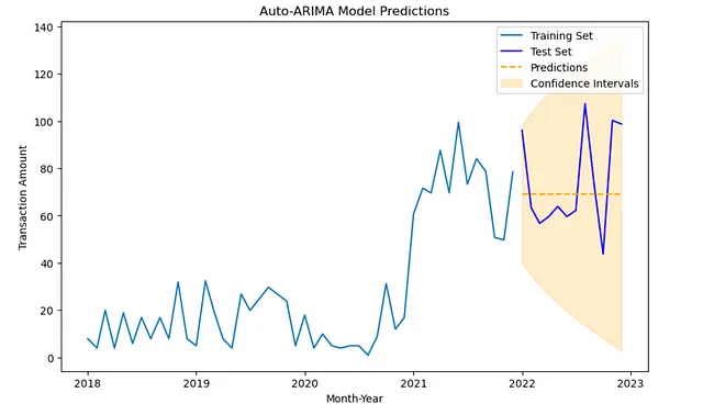
现在让我们编写一个提示,要求ChatGPT根据数据框ts_df生成一个自动ARIMA时间序列预测模型。我们将指定数据包含一个名为month_year和transaction_amount的列。
时间序列预测问题:“Prompt 1”
Write python code that builds an automarima time series model given
the dataframe ts_df, which contains columns month_year and transaction_amount.
Make sure to split the data for training and testing.
输出:
import pandas as pd
from pmdarima import auto_arima
from sklearn.model_selection import train_test_split
from sklearn.metrics import mean_squared_error
import matplotlib.pyplot as plt

# Assuming 'month_year' is in datetime format
# If not, you can convert it using ts_df['month_year'] = pd.to_datetime(ts_df['month_year'])

# Sorting the DataFrame by 'month_year'
ts_df = ts_df.sort_values(by='month_year')

# Creating a time series with 'month_year' as the index
ts_series = pd.Series(ts_df['transaction_amount'].values, index=ts_df['month_year'])

# Splitting the data into training and testing sets
train_size = int(len(ts_series) * 0.8)  # Adjust the split ratio as needed
train, test = ts_series[:train_size], ts_series[train_size:]

# Using auto_arima to find the best ARIMA model on the training set
autoarima_model = auto_arima(train, seasonal=True, stepwise=True, suppress_warnings=True, trace=True)

# Displaying the summary of the best model
print(autoarima_model.summary())

# Making predictions on the test set
forecast_steps = len(test)
forecast, conf_int = autoarima_model.predict(n_periods=forecast_steps, return_conf_int=True)

# Evaluating the model on the test set
mse = mean_squared_error(test, forecast)
print(f'Mean Squared Error on Test Set: {mse}')

# Plotting the actual vs. predicted values
plt.figure(figsize=(10, 6))
plt.plot(train.index, train.values, label='Training Set')
plt.plot(test.index, test.values, label='Test Set', color='blue')
plt.plot(test.index, forecast, label='Predictions', linestyle='--', color='orange')
plt.fill_between(test.index, conf_int[:, 0], conf_int[:, 1], color='orange', alpha=0.2, label='Confidence Intervals')
plt.xlabel('Month-Year')
plt.ylabel('Transaction Amount')
plt.title('Auto-ARIMA Model Predictions')
plt.legend()
plt.show()
这将生成以下输出:
我们可以通过多种方式改进此提示。例如,我们可以指定另一个,可能更高级的时间序列模型,可以指定另一个性能度量标准,或一个特定的可视化库。典型的时间序列分析工作流程包括比较不同模型及其性能。
让我们更新我们的提示,建立和比较ARIMA和SARIMAX时间序列模型。
时间序列预测提示2:
Write python code that builds two time series models and compares performance.
Build an automarima time series model and a SARIMAX model
given the dataframe ts_df, which contains columns month_year and
transaction_amount.Make sure to split the data for training and testing.
Visualize training, testing and predictions for each model.
输出:
import pandas as pd
import numpy as np
from pmdarima import auto_arima
from statsmodels.tsa.statespace.sarimax import SARIMAX
from sklearn.model_selection import train_test_split
from sklearn.metrics import mean_squared_error
import matplotlib.pyplot as plt

# Assuming 'month_year' is in datetime format
# If not, you can convert it using ts_df['month_year'] = pd.to_datetime(ts_df['month_year'])


# Sorting the DataFrame by 'month_year'
ts_df = ts_df.sort_values(by='month_year')

# Creating a time series with 'month_year' as the index
ts_series = pd.Series(ts_df['transaction_amount'].values, index=ts_df['month_year'])

# Splitting the data into training and testing sets
train_size = int(len(ts_series) * 0.8)  # Adjust the split ratio as needed
train, test = ts_series[:train_size], ts_series[train_size:]

# Auto-ARIMA Model
autoarima_model = auto_arima(train, seasonal=True, stepwise=True, suppress_warnings=True, trace=True)
autoarima_forecast, autoarima_conf_int = autoarima_model.predict(n_periods=len(test), return_conf_int=True)

# SARIMAX Model
order = (1, 1, 1)  # Adjust the order based on your analysis
seasonal_order = (1, 1, 1, 12)  # Adjust the seasonal order based on your analysis
sarimax_model = SARIMAX(train, order=order, seasonal_order=seasonal_order)
sarimax_results = sarimax_model.fit(disp=False)
sarimax_forecast = sarimax_results.get_forecast(steps=len(test))
sarimax_conf_int = sarimax_forecast.conf_int()

# Evaluating Models
autoarima_mse = mean_squared_error(test, autoarima_forecast)
print(f'Auto-ARIMA Model Mean Squared Error on Test Set: {autoarima_mse}')

sarimax_mse = mean_squared_error(test, sarimax_forecast.predicted_mean)
print(f'SARIMAX Model Mean Squared Error on Test Set: {sarimax_mse}')

# Plotting Results
plt.figure(figsize=(12, 6))

# Auto-ARIMA Plot
plt.subplot(2, 1, 1)
plt.plot(train.index, train.values, label='Training Set')
plt.plot(test.index, test.values, label='Test Set', color='blue')
plt.plot(test.index, autoarima_forecast, label='Auto-ARIMA Predictions', linestyle='--', color='orange')
plt.fill_between(test.index, autoarima_conf_int[:, 0], autoarima_conf_int[:, 1], color='orange', alpha=0.2, label='Confidence Intervals')
plt.title('Auto-ARIMA Model Predictions')
plt.legend()

# SARIMAX Plot
plt.subplot(2, 1, 2)
plt.plot(train.index, train.values, label='Training Set')
plt.plot(test.index, test.values, label='Test Set', color='blue')
plt.plot(test.index, sarimax_forecast.predicted_mean, label='SARIMAX Predictions', linestyle='--', color='green')
plt.fill_between(test.index, sarimax_conf_int.iloc[:, 0], sarimax_conf_int.iloc[:, 1], color='green', alpha=0.2, label='Confidence Intervals')
plt.title('SARIMAX Model Predictions')
plt.legend()

plt.tight_layout()
plt.show()
这将生成以下输出:
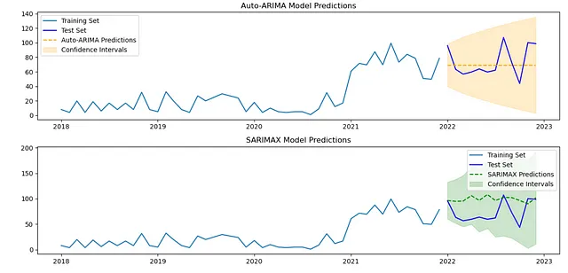
SARIMAX模型的好处在于它允许您明确地将外部变量(外部因素)纳入时间序列模型中。在此,我们没有明确地包含外部变量,因此我们的SARIMAX模型本质上是一个SARIMA模型。一个有趣的提示是要求ChatGPT使用我们的数据中的某一列来构建一个特征,并将此特征用作外部变量。例如,您可以将商家所在州作为我们的SARIMAX模型的外部变量之一。一旦定义了一个包含商家所在州编码值的数据框(即:exog_train_merchant_state,exog_test_merchant_state),您可以使用以下逻辑将其指定为外部变量:
sarimax_model = SARIMAX(train, order=(1, 1, 1), seasonal_order=(1, 1, 1, 12), exog=exog_train_merchant_state)
sarimax_results = sarimax_model.fit(disp=False)
sarimax_forecast = sarimax_results.get_forecast(steps=len(test), exog=exog_test_merchant_state)  # Use exogenous variables for forecasting
sarimax_conf_int = sarimax_forecast.conf_int()
主要要点:
- 指定变量名和列名:与我们的数据可视化示例类似,请确保使用具体的变量名和列名。这将有助于确保输出的代码不引用未定义的变量或列名。
- 确保数据被分为训练和测试集:建立预测模型的一个重要步骤是将数据分为训练和测试集。这样可以确保模型没有在相同的数据上进行训练和验证。这有助于确保模型能够推广到未知数据。
- 指定不同模型类型进行比较:时间序列分析工作流的另一个重要部分是构建、验证和比较不同的模型。这将有助于确保您为您的使用情况选择最佳模型。
其他提示
- 可视化任务:我们可以设计提示,以获取有关时间序列数据的其他洞见。这包括通过面积图、移动平均图和季节性分解进行可视化。
- 时间序列预测:我们还可以构建提示来建立、验证和比较更多的时间序列预测模型,包括使用我们的ARIMA和SARIMAX模型。这包括构建指数平滑模型和长短期记忆(LSTM)模型。
这些附加提示、它们的输出以及随附的Jupyter笔记本可在DataFabrica上获得。您可以在此处访问附加提示和笔记本。
结论
在这篇文章中,我们讨论了如何迭代改进提示来帮助引导时间序列分析任务。首先,我们讨论了如何定义一个提示来生成时间序列数据的可视化。然后,我们通过添加上下文来改进这个提示,以指定变量和列的正确名称。此外,我们更新了提示,使用一个替代库Plotly来生成时间序列可视化,而不是默认选择的Matplotlib。然后,我们考虑了为生成时间序列预测模型进行提示工程的任务。我们开始让ChatGPT构建一个ARIMA时间序列预测模型。然后,我们更新了提示,生成了能够让我们构建和比较ARIMA和SARIMAX模型的代码。
尽管我们已经介绍了一些有关时间序列分析的提示工程示例,但仍有许多其他技术我们未涵盖。对于可视化,这些技术包括移动平均分析、面积图、季节分解等。对于时间序列预测,我们还可以使用更多的时间序列预测模型,如指数平滑模型和长短期记忆(LSTM)模型。您可以在这里探索生成这些分析类型代码的提示。